design
What Makes a Desk Accessory "Aesthetic"? A Guide.
Not every desk accessory — from organizers to phone stands — earns the word "aesthetic." Here's what actually separates good design from clutter.

Scroll through any desk-setup hashtag and you'll see the word everywhere: aesthetic. It's used to describe a phone stand, a pen holder, a tray, a cable clip — sometimes all four in the same photo. But ask five people what actually makes a desk accessory "aesthetic," and you'll get five different answers, most of them some version of "I just know it when I see it."
That's not quite good enough if you're trying to build a desk setup you'll still like in a year, not just a photo you'll still like for a week.
Quick answer: An aesthetic desk accessory is one where the design choices — material, color, proportion, and form — feel intentional and cohesive, rather than decorative on top of a purely functional object. It's the difference between an object that was styled after the fact and one that was designed that way from the start.
Here's what that actually means when you're picking out desk accessories or rethinking your office essentials from scratch.
Key Takeaways
- "Aesthetic" refers to a cohesive design language (material, color, proportion) — not just decoration
- Five traits define it: material/texture, color cohesion, proportion, hidden function, and personal signature
- Many "aesthetic" products sacrifice function for looks — this is the most common design failure in the category
- A well-designed phone stand is the clearest small-scale example of getting both aesthetics and function right
- Build a desk setup around one material family and 2–3 tones before adding personality pieces
The Difference Between "Aesthetic" and Just "Nice to Look At"
Plenty of desk accessories look nice in isolation. A pastel organizer. A marble-effect tray. A gold-trimmed pen cup. None of that is wrong — but "nice to look at" is a low bar, and it's also a subjective one that changes with every trend cycle.
"Aesthetic," used properly, is closer to a design term than a compliment. It refers to a consistent visual language: the object's material choice makes sense with its function, its proportions feel deliberate rather than arbitrary, and it looks like it belongs on your desk rather than like it was added to your desk.
This is why some of the most "aesthetic" desk setups you'll see online aren't actually the most expensive or elaborate ones. They're the most consistent ones.
5 Elements That Make a Desk Accessory Feel Aesthetic
If you strip away trend cycles and personal taste, most genuinely well-designed desk accessories share five traits.
1. Material and Texture
Good design tends to lean on materials that age well and feel intentional to the touch — wood, matte metal, tempered glass, quality acrylic. Cheap, glossy plastic is usually the fastest way to make an accessory look temporary, even if the shape is right.
2. Color Palette and Cohesion
A single striking accessory can work on its own. Two or three accessories that don't share any color, tone, or material logic will almost always read as clutter, no matter how nice each individual piece is. Aesthetic desk setups are built around a palette, not a pile of favorites.
3. Proportion and Scale
This is the most overlooked factor. An accessory that's too small looks like an afterthought; one that's too large overwhelms the desk. Well-designed objects are scaled to their function — a phone stand sized for a phone, not a tablet stand pretending to be one.
4. Function Hidden in Form
The best desk accessories don't look like they're trying to solve a problem. A charging cable is routed, not zip-tied. A stand holds a device at the right angle without a chunky mechanism doing all the visible work. The function is there — it's just not shouting about it.
5. Personal Signature
The final layer is the one algorithms can't standardize: something that reflects the person using the desk, not just the trend they screenshotted. This is usually the difference between a desk that looks styled for a photo and one that looks lived-in and intentional.
The Aesthetic Trap: When Pretty Stops Being Practical
There's a common failure mode in this category worth naming directly: accessories that are designed almost entirely for how they photograph, with function treated as an afterthought.
A desk organizer with compartments too small for anything you actually own. A tray that looks sculptural but slides every time you reach for something. A stand that holds a phone beautifully in a promotional photo and topples the moment you tap the screen.
This is the trap of chasing "aesthetic" as a look rather than a design principle. It results in desks that photograph well and function poorly — and objects that get quietly replaced within a few months, which is the opposite of good design.
Case Study: The Humble Phone Stand
The phone stand is a useful example because it's one of the most common desk accessories — and one of the most polarized in how it's designed.
Most functional phone stands are built by people solving an engineering problem: hold a phone at a usable angle, stay stable, maybe charge it. The result is often effective and completely forgettable — black plastic or rubber-gripped metal that does the job and disappears visually into the desk.
Most "aesthetic" phone stands go the opposite direction — they're designed to look good in a flat-lay first, and to hold a phone second. Thin bases tip over. Narrow grooves scratch phone cases. Materials chosen for their look rather than their grip or weight distribution mean the stand shifts every time you pick up your phone.
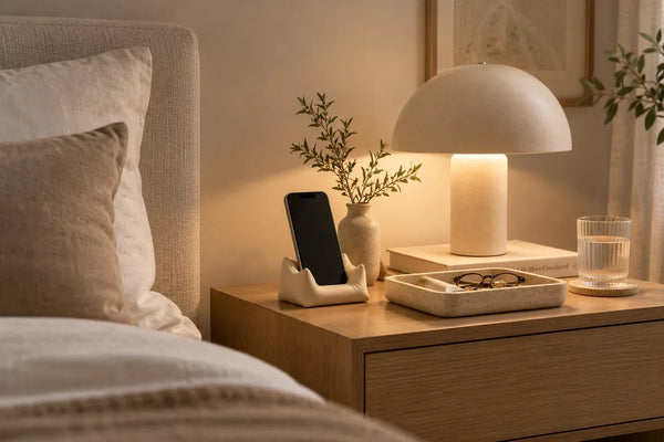
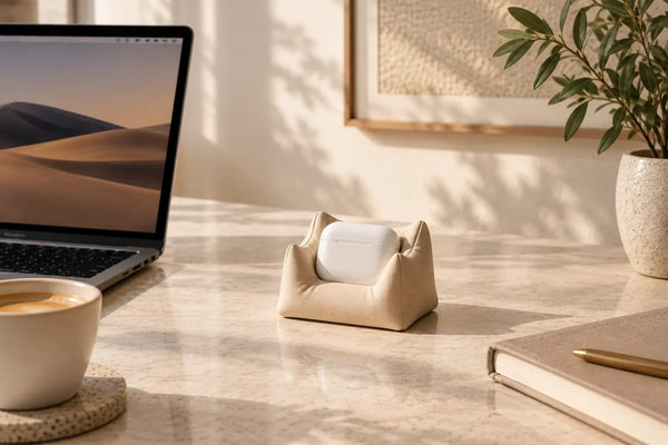
A phone stand that actually gets this right sits in the middle of those two extremes: it's built from a material and shape that hold their own visually on a styled desk, and it's weighted, angled, and sized so it functions like a proper stand should — stable enough for video calls, sturdy enough for daily use, and not an eyesore next to the rest of your setup. That middle ground is rarer than it should be, mostly because it's harder to design for than either extreme on its own.
How to Build an Aesthetic (and Functional) Desk Setup
If you're rethinking your desk accessories or office essentials from the ground up, a simple filter helps: for every item, ask whether it earns its place on both criteria — does it look intentional, and does it actually work well.
A practical starting sequence:
- Pick one material family (wood, matte metal, or a neutral acrylic) and build around it
- Choose a palette of two to three tones, not five
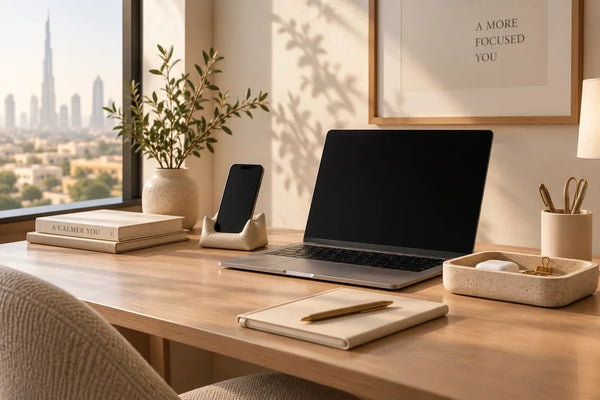
- Prioritize the accessories you touch daily — phone stand, organizer, tray — since these set the tone for everything else
- Add one or two accessories with personality last, once the functional base is solid
Desk setups that follow this order tend to hold up over time, because the foundation isn't dependent on a trend staying popular.
Aesthetic Desk Accessories: Quick FAQ
What does "aesthetic" mean when people describe desk accessories?
It refers to a cohesive design language — consistent material, color, and proportion — rather than simply meaning "decorative" or "trendy."
Can a desk accessory be both aesthetic and functional?
Yes, though it's harder to design for than either quality alone. The strongest desk accessories are built with function as a starting requirement, not an afterthought to appearance.
What are the most important desk accessories to get right first?
The items used daily — a phone stand, an organizer, and a tray or catch-all — since they set the visual and functional tone for the rest of the desk.
Do desk accessories need to match exactly?
No — they need to share a logic (material, tone, or proportion), not be identical. Overly matched sets can look generic; a shared design language looks intentional.
How can you tell if a desk accessory is good quality or just trendy?
Check whether the design choice serves a function. A shape, color, or material that exists purely to photograph well — and makes the object less stable, less durable, or harder to use — is usually a trend-driven choice rather than a quality one.
What's the best material for aesthetic desk accessories?
There's no single best material, but wood, matte metal, and quality acrylic tend to age better visually than glossy plastic. The better question is picking one material family and staying consistent across your desk rather than mixing several.
Is a phone stand considered a desk accessory?
Yes — phone stands are one of the most commonly used desk accessories, and one of the clearest examples of the aesthetic-versus-functional trade-off, since they're touched daily and need to be visually cohesive with the rest of the desk.
How many accessories should be on a desk for it to look aesthetic?
There's no fixed number, but most well-designed desk setups use 3–5 accessories built around one material and color palette. Beyond that, cohesion becomes harder to maintain and the desk starts to look cluttered regardless of how nice each item is individually.
What's the difference between a styled desk and a designed desk?
A styled desk is arranged to look good for a photo, often with accessories added just before the shot. A designed desk is built around accessories chosen for daily use, where the visual cohesion comes from the objects actually belonging there — not from staging.
Looking to build out a desk that actually holds up to daily use? Explore our desk accessories collection — including phone stands designed to work as hard as they look good.